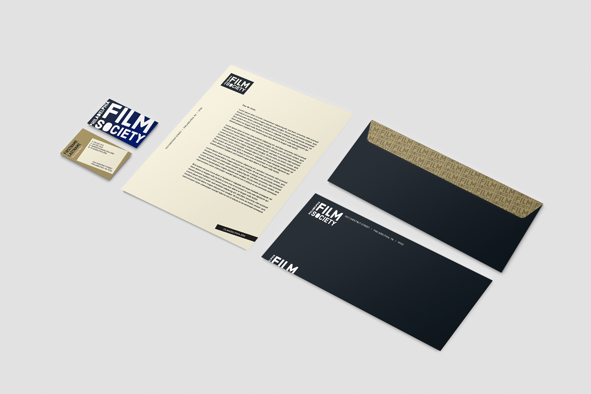
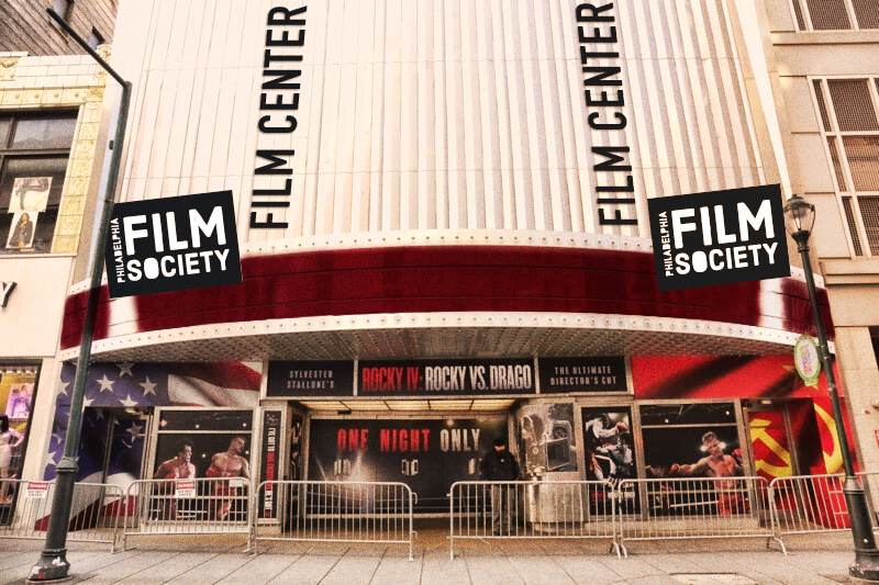
The Philadelphia Film Society aesthetic is CINEMATIC. From colors to design elements, the Philadelphia Film Society wants its audience to associate PFS with the very thing their organization hopes to elevate: film.
The following represents the initial stages of reimagining the overall visual look and feel of the Philadelphia Film Society. While there have been numerous iterations since then, this is where the transformation began.
Date: 2023 | Client: Athena Global Advisors | Role: Layout, Design
The Theaters
Each theater has a unique character but serves as a natural extension of the PFS organization. Their visual identities should reflect this relationship. Each theater has its own combination of colors for creative applications.
Spray Paint Graphics
Extending the inspiration behind the PFS logo to brand materials, a Spray Paint splash to add texture where appropriate. The Spray Paint may also be used as a spotlight element when execution is light on content.
Logo Pattern
The PFS logo may be used as a watermarked pattern to add depth to brand materials. The pattern may be used as a supporting design element.
The Frame
While it's crucial to steer clear of explicit film references, subtle incorporation of a film strip frame is permissible for imagery. However, any application should limit the use of frames to a maximum of two, and it's essential to refrain from including film strip perforations.
Logo Frame
Another way to extend the stencil inspiration behind the PFS logo is by framing imagery through the “S” and “O” of the logo. It’s important to use only these letters, as shown here, so that the imagery isn’t too hidden.


This project was created for Athena Global Advisors in collaboration with their creative team.
